A watercolor color wheel is a circle of 12 colors that you mix yourself from three paints: a yellow, a red and a blue. Making one takes about an hour. Once it's done, you can look at it and see what any two of your paints will make together, and which colors will make each other glow on a page.
Most color wheel tutorials stop when the circle is finished. Here I'll show you how to make one, and then how to use it on a real coloring page: which colors to put side by side, which to keep apart, and how to mix a shadow without reaching for black.

What a watercolor color wheel shows you
The wheel is a map of how colors relate to each other. It's built in three rings of mixing, and each ring comes from the one before it.
- Primary colors are yellow, red and blue. You can't mix them from other paints, so they're your starting point.
- Secondary colors are orange, purple and green. Each one is two primaries mixed together.
- Tertiary colors sit in between. Each one is a primary mixed with the secondary next to it: yellow-orange, red-orange, red-purple, blue-purple, blue-green and yellow-green.
Three plus three plus six makes 12, and that's the whole wheel.
Why your paints won't look like the textbook wheel
The printed wheels in books show perfect primaries. Real watercolor paints aren't perfect. Every red leans a little toward orange or toward purple, and every blue leans a little toward green or toward purple.
That lean shows up in your mixes. A red that leans orange already holds a touch of yellow, so when you mix it with blue, you're really mixing all three primaries, and the purple comes out grayish brown. This is the most common surprise when people paint their first wheel, and it isn't a mistake on your part. It's the paint.
The fix is to use a red and a blue that lean toward each other when you want a clean purple. I explain warm and cool primaries in A Six-Color Watercolor Palette. For your first wheel, simply use the three primaries you have and notice where the mixes turn dull. That alone teaches you a lot about your paints.
What you need
- Three paints: a yellow, a red and a blue from the set you already own
- Watercolor paper: one sheet of 140 lb / 300 gsm, or a sheet of mixed-media paper
- A round brush, size 6 or 8
- A pencil and something round to trace, like a small plate, a bowl or an old CD
- Two jars of water, a paper towel and a scrap of the same paper for testing mixes
If you're still putting your kit together, Watercolor Coloring for Beginners: The Supplies You Actually Need covers each piece.
How to make a watercolor color wheel
- Draw the circle. Trace a plate or a bowl about 7 inches across, then trace a smaller circle in the middle. Divide the ring into 12 equal segments, like the hours on a clock.
- Paint the three primaries. Put yellow at 12 o'clock, red at 4 o'clock and blue at 8 o'clock. Paint each segment in one even layer.
- Mix the three secondaries. Mix yellow and red for orange (2 o'clock), red and blue for purple (6 o'clock), and blue and yellow for green (10 o'clock). Test each mix on scrap paper before it goes on the wheel.
- Mix the six tertiaries. Fill each empty segment with a mix of the two colors on either side of it. Yellow-orange goes between yellow and orange, and so on around the circle.
- Skip around as you paint. Never paint a segment while the one next to it is still wet, or the two will bleed together. Paint every other segment, let them dry, then fill in the gaps.
- Write the paint names in pencil beside the three primaries, so you know exactly what made each mix.
- Let it dry completely and keep it by your palette. You'll use it more than you expect.
Some yellows are weak next to a strong blue, so your green may need more yellow than blue to look balanced. Mix until the color looks halfway between its two neighbors, not until the amounts are equal.
If you'd like to add a pale ring on the inside, paint each color again with more water toward the center. It shows you how light each color can go, and Watercolor Water-to-Paint Ratio explains how to judge the strength of a mix.
Reading your color wheel: four things it tells you

Complementary colors: opposites that glow
Colors directly across the wheel from each other are called complementary colors: red and green, blue and orange, yellow and purple. Placed side by side, each one makes the other look brighter. A red roof against green trees jumps forward in a way a red roof against a pink sky never will.
Use complements where you want the eye to go first. A small amount is enough. One red door on a green hillside does more than a whole page of red and green.
Analogous colors: neighbors that feel calm
Colors that sit next to each other on the wheel are called analogous colors: blue, blue-green and green, or yellow, yellow-orange and orange. They share some of the same paint, so they blend gently and feel peaceful together.
A coastal page painted in blues and blue-greens, or an autumn page in yellows, oranges and reds, almost always looks harmonious. If a page feels busy or noisy, try pulling most of it toward one side of the wheel.
The warm side and the cool side
Draw a line across your wheel from yellow-green to red-purple. The yellows, oranges and reds on one side feel warm, like sunlight. The greens, blues and purples on the other side feel cool, like shade and distance.
That's why sunlit walls look right with a touch of yellow and shadows look right with a touch of blue. I go further into this in Warm and Cool Light.
Mixing opposites makes natural grays
Mix two complements together and they cancel each other out. A little green in a red softens it toward brick. More green turns it into a warm gray. The same happens with blue and orange, or with purple and yellow.
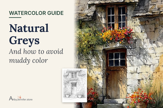
These grays are much livelier than gray from a tube, and they always belong to the colors around them. When an area looks too bright, a tiny touch of its opposite calms it down. Natural Grays in Watercolor shows the mixes I use for stone, slate and shadows.
When you're ready to try this on a real page, every set in my shop comes with the painted reference and a color guide for each design, so you can compare your color choices with mine. The watercolor coloring pages collection shows them all.
Using the color wheel on a coloring page
This is where the wheel becomes useful. Here are two of my own pages, with the color guides that come with them, read through the color wheel.
Example 1: Purple and Green Stairway

The color guide for this page lists dioxazine violet for the purple house, sap green for the green house, cadmium orange for the autumn tree, raw sienna for the stone, burnt sienna for the doors and Payne's grey for the roofs and steps.
Look at where those colors sit on the wheel:
- Purple and yellow-green are nearly opposite. That's why the two houses look so bright standing next to each other. Sap green leans toward yellow, which makes it an even stronger partner for violet.
- The orange tree sits against the cool purple and green. Warm against cool makes the tree feel like it's catching the light.
- The stone and doors are quiet browns. Raw sienna and burnt sienna are softened oranges, so they let the two bright houses do the talking.

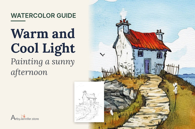
Example 2: Blue Door Cottage on the Rocks

This page uses cadmium red for the roof, cerulean blue for the door and sky, sap green for the grass, cadmium orange for the autumn color, yellow ochre for the walls and field, and Payne's grey for the rocks.
- The red roof is the only strong red on the page, and the grass below it is green, its complement. That's why your eye goes straight to the roof.
- The blue sky and the orange autumn tones in the grass are opposites too. They keep the whole scene warm and fresh at the same time.
- The white walls are mostly bare paper, with only a soft shadow on one side. Leaving them quiet lets the color around them shine.
How to change colors with confidence
You don't have to follow my colors. If you want a blue house instead of a purple one, the wheel tells you what changes. The opposite of blue is orange, so the orange tree will look even brighter beside it. A green house next to a blue one, on the other hand, is a neighbor pairing: calmer, softer, less contrast.
A simple rule for any page: pick one pair of opposites for the main point of interest, keep the rest of the page in neighbors of those colors, and use soft grays mixed from the two opposites for shadows.
Common color wheel problems
| What you see | Why it happens | What to try |
|---|---|---|
| Purple comes out gray or brown | Your red leans orange or your blue leans green, so all three primaries end up in the mix | Use a red that leans purple, like a crimson, with ultramarine blue |
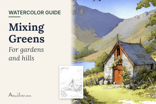
| Green looks dull or olive | Your blue or yellow leans toward red | Try a lemon yellow with a greenish blue. Mixing Greens in Watercolor has more combinations |
| Segments bled into each other | A neighboring segment was still wet | Paint every other segment, let them dry, then fill the gaps |
| Colors dried paler than you mixed them | Watercolor dries lighter than it looks wet | Add a second layer once the first is dry |
| One color overpowers its neighbors | Some paints are much stronger than others | Add the strong color to the weak one a little at a time, not the other way around |
Frequently asked questions
How many colors do I need to make a watercolor color wheel?
Three: a yellow, a red and a blue. Every other color on a 12-color wheel is mixed from those. If you'd like cleaner mixes, a six-color palette with a warm and a cool version of each primary helps.
Should I make a 6-color or a 12-color wheel?
A 6-color wheel with just primaries and secondaries is a good warm-up. The 12-color wheel teaches you much more, because the in-between mixes are where you learn how much of each paint to use.
Why is my mixed purple muddy?
Most often the red leans toward orange, so it carries a little yellow into the mix. Yellow is the opposite of purple, and it grays it down. A red that leans toward purple, mixed with ultramarine, gives a much cleaner violet.
Do I need a color wheel to paint coloring pages?
No. Every design in my sets comes with a color guide, so the planning is already done for you. The wheel helps when you want to change the colors and still have them look good together.
Your next page
Once your wheel is dry, try it on a page where color does most of the work. The 15 Colorful Town Scenes set is full of painted houses side by side, which makes it ideal for playing with opposites and neighbors. If you're just starting out, my 8 free watercolor coloring pages are a gentle way to try it first.
To keep going with color:
- A Six-Color Watercolor Palette, for cleaner mixes
- Natural Grays in Watercolor, for shadows mixed from opposites
- How to Watercolor a Coloring Page, the step-by-step method for any page