You don't need dozens of colors to paint beautiful coloring pages. With six well-chosen paints, a warm and a cool version of each primary, you can mix bright greens, glowing oranges, clear violets and soft natural grays.
I learned this the expensive way. For a long time I kept buying new tubes, and my palette grew so crowded that I'd reach for a ready-made green instead of mixing one, then wonder why my pages looked a bit disjointed. Cutting back to six forced me to learn how each paint behaves, and my colors started to look like they belonged together, because they all came from the same few tubes.

New to painting coloring pages? Start with my step-by-step guide on how to watercolor a coloring page, then come back to this one.
Warm and cool primaries
Every red, yellow and blue leans slightly toward one of its neighbors. A lemon yellow leans toward green, so we call it cool. A deep golden yellow leans toward orange, so it's warm. The same goes for the others:
- Yellows: lemon yellow (cool, toward green) and a warm yellow such as hansa yellow deep or cadmium yellow (toward orange).
- Reds: a rose or crimson such as quinacridone rose (cool, toward violet) and a scarlet such as pyrrol or cadmium red (warm, toward orange).
- Blues: phthalo blue or cerulean (cool, toward green) and ultramarine (warm, toward violet).
Having both versions of each primary is what makes six enough. You choose clean, bright mixes or softer, earthier ones just by picking which pair to combine.

The mixing rule that matters
When you mix two colors, any trace of the third primary dulls the result. Ultramarine leans toward red, so mixing it with lemon yellow gives a slightly muted green. Phthalo blue leans toward yellow, so mixing it with lemon yellow gives a bright, fresh green.
So: for a bright mix, choose the two paints that lean toward each other. For a softer, more natural mix, choose a pair that leans away. Both are useful. Bright mixes suit flowers and painted doors; softer ones suit old stone, distant hills and shadows.
What six colors can mix
| You want | Mix | Result |
|---|---|---|
| Bright spring green | Lemon yellow + phthalo blue | Clean, fresh green |
| Olive or moss green | Warm yellow + ultramarine | Soft, natural green |
| Glowing orange | Warm yellow + scarlet | Bright orange for fall trees |
| Clear violet | Rose + ultramarine | Purple for walls and flowers |
| Brick and terracotta | Scarlet + a little ultramarine | Warm, earthy red |
| Stone and sand | Warm yellow + scarlet + a touch of blue | Light ochre or sienna tones |
| Natural gray | Scarlet + phthalo, or ultramarine + a warm orange | Soft gray for roofs and shadows |
| Near black | Ultramarine + crimson + a little yellow, thick | Rich dark for windows |
Plenty of painters add one or two convenience colors later, often burnt sienna and yellow ochre, because they save time. It's still worth learning to mix them first.
Setting up your palette
Place the six colors around the edge of your palette in color-wheel order: lemon yellow, warm yellow, scarlet, rose, ultramarine, phthalo or cerulean, and back to lemon. Neighbors on the palette are the ones that mix cleanly, so the layout itself reminds you which pairs to choose. Keep the middle clear for mixing.
Before painting a page, make a quick mixing chart on scrap paper: each color mixed with each of the others. It takes ten minutes, and you'll refer to it for years.
Translating a color guide into six colors
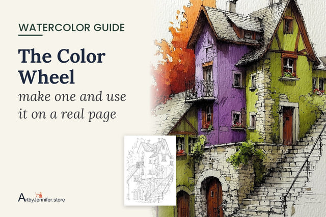
Every page in my sets comes with a color guide naming the paints I used. If you work from six colors, you don't need to buy those paints. Here's how the stairway page translates:
| Color guide paint | Where it's used | Six-color mix |
|---|---|---|
| Cadmium orange | The tree | Warm yellow + scarlet |
| Dioxazine violet | The purple house | Rose + ultramarine |
| Sap green | The green house | Lemon yellow + a touch of phthalo |
| Raw sienna | Stone base | Warm yellow + a little scarlet + a speck of ultramarine |
| Burnt sienna | Wooden doors | The stone mix, stronger, with more scarlet |
| Payne's grey | Roofs, step shadows | Ultramarine + warm orange |

A few notes on actually painting it:
- The tree: paint it loosely and drop a little extra scarlet into the shadow side while it's wet.
- The purple house: more ultramarine gives a cooler, bluer purple; more rose gives a warm plum. Keep the wash a little lighter at the top of the wall, where the light hits.
- The green house: mix plenty. A green wall is a large area and matching the mix halfway through is nearly impossible.
- Roofs and steps: lean the gray bluer for slate and warmer for the shadows under each step. Leave the top of each step as white paper and paint only the shadow under its edge.

Small habits for clean mixes
- Add dark to light. Start with the lighter color and add the darker one bit by bit. It takes far less blue to turn yellow green than the other way round.
- Test on scrap paper. Wet mixes look darker in the palette than they dry on the page.
- Keep a clean water jar. Dirty water quietly dulls every mix.
- Two or three colors at most in any one mix keeps it clean.
Common mixing problems
| What you see | Why it happens | What to try |
|---|---|---|
| Green looks dull | Blue leans toward red (ultramarine) | Use phthalo or cerulean with lemon yellow |
| Violet looks brown | Red leans toward orange (scarlet) | Use rose or crimson with ultramarine |
| Mixes turn muddy | Too many colors, or dirty water | Mix two colors at a time; change your water |
| Color dried much paler | Mix too watery | Make it a little stronger than you think |
Frequently asked questions
What are the best six colors for a watercolor palette?
A warm and a cool of each primary: lemon yellow and a warm yellow, a rose or crimson and a scarlet, and phthalo blue or cerulean with ultramarine. Brands differ, so choose transparent paints you like.
Can I mix brown and black from six colors?
Yes. Browns come from orange plus a little blue; a rich near black comes from ultramarine, crimson and a touch of yellow mixed thickly.
Do I need to buy new paints for this?
Not necessarily. Sort the colors you already have into warm and cool versions of each primary. Most student sets already include something close.
Practice pages
Bright, colorful houses are a good test for a small palette, because every wall is a different mix. The 15 Colorful Town Scenes set is full of them, and each page comes with a color guide you can translate into your own six colors.
The two mixes people struggle with most from a small palette are greens and grays, so each has its own post: Mixing Greens and Natural Grays.
To see how all six colors relate to each other, paint them into a wheel: Watercolor Color Wheel for Beginners shows how, and how to use it on a real page.