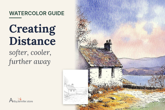
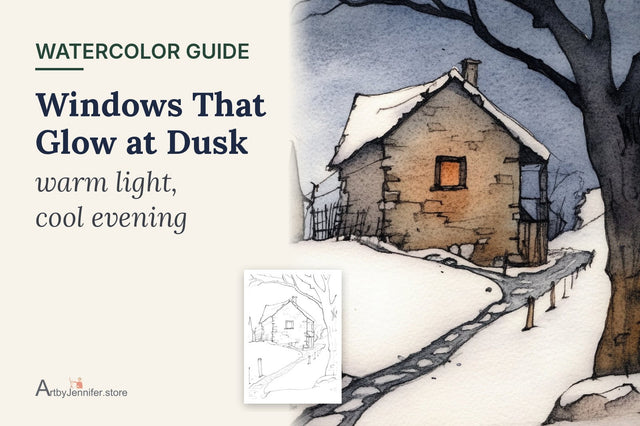
Old stone walls, slate roofs, garden paths, shadows, clouds and weathered wood are all grays of one kind or another. Get them right and everything else on a cottage page looks richer. Get them wrong and the page turns flat, chalky or, worst of all, muddy.
The grays that look best aren't made from black and white. They're mixed from colors, so they keep a little warmth or coolness. And once you know how a good gray is made, you also know why mud happens, because it's the same mixing gone wrong.

New to painting coloring pages? Start with my step-by-step guide on how to watercolor a coloring page, then come back to this one.
Why mixed grays look better
A gray from the tube, or black thinned with water, has no color temperature. It sits on the page like a shadow cut out of paper. A gray mixed from two colors keeps a hint of both, so it can lean warm (toward brown) or cool (toward blue), and it feels like part of the same light as the rest of the painting.
Payne's grey is still a handy tube color, and the color guide for this page uses it for the roof slates. Even so, it looks livelier with a little warm color dropped into it on the paper.
Mix opposites
Colors opposite each other on the color wheel cancel each other out. Mix them in the right balance and you get gray. The three pairs I use most:

- Ultramarine + burnt sienna: the classic watercolor gray. More blue gives a cool slate gray; more sienna a warm stone gray. It granulates too, which looks like real stone.
- A red + a green: a soft, slightly olive gray, lovely for shadows in gardens.
- A violet + a yellow: a warm, sandy gray for paths and old plaster.
Try each pair on scrap paper as a small strip, adding more of one color as you go. You'll watch the gray slide from cool to warm, and that one exercise teaches more than any chart.
Why is my watercolor muddy?
"Mud" is what painters call dull, lifeless color that looks dirty rather than gray. It nearly always comes from one of these:
- Too many colors in one mix. Three or four paints stirred together lose all their brightness. Stick to two, three at most.
- Over-stirring on the palette. Mix lightly and let the two colors finish blending on the paper. A gray with a little variation looks alive.
- Working into a half-dry wash. Brushing back into paint that's starting to dry lifts and stirs the layer underneath. Work while it's wet, or wait until it's fully dry.
- Too many layers. Four or five glazes over the same spot can dull even clean colors.
- Opaque paints mixed together. Some paints are slightly chalky, and two of them together look flat. Transparent paints keep grays clear.
The layers one is the trap I fell into most. When a stone wall looked dull, my instinct was to add another layer to "fix" it, and every layer made it a little worse. These days, if a gray looks dead, I leave it alone and add a few small, clean darks around it instead. Contrast does more than another coat ever did.
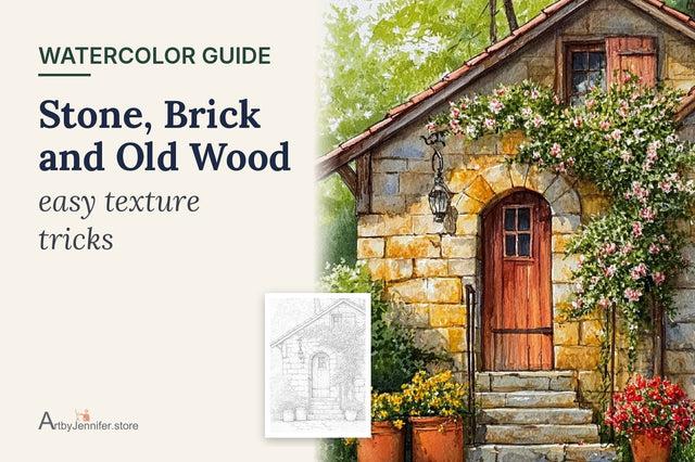
How I painted the stone doorway

A warm base for the stone
Following the color guide, I washed the walls with yellow ochre and dropped raw sienna into the lower stones while it was still wet. This warm base is what makes the stone glow; the grays go on top of it, not instead of it. Where the sun hits hardest, I left the paper bare.
Graying the stones, one at a time
Once the wall was dry, I mixed ultramarine and burnt sienna into two puddles, one leaning blue and one leaning brown, and painted single stones in a light wash, switching between the two. Some stones kept only the golden base. Thin gaps of base color between the stones became the mortar.
The slate roof
The slates are Payne's grey at different strengths, with a touch of burnt sienna dropped into a few while they were wet so the roof looks weathered.
Door, flowers and shadows
The wooden door is burnt sienna with darker streaks along the grain, and the window box flowers are cadmium red and cadmium orange with sap green leaves. They look even brighter against the soft grays. The shadows inside the window recesses, under the door frame and below the pots are a cool gray, ultramarine with just a little sienna, kept thin so the stone texture shows through. The window panes are a deep blue-brown mix rather than black.

If there's one thing to take from this page, it's to use both warm and cool grays in the same wall. Warm grays come forward and suggest sunlight; cool grays sit back and suggest shade or age. Scatter them across the stones and the wall gets depth without a single extra line of detail.
Common gray problems
| What you see | Why it happens | What to try |
|---|---|---|
| Gray looks dead and flat | Black or a single tube gray used | Mix from opposites, or drop a warm color into Payne's grey |
| Mix turned brown mud | Too many colors stirred together | Use two colors only; mix lightly |
| Stone looks like concrete | Same gray on every stone | Alternate warm and cool grays; leave some stones golden |
| Dull patches after a second layer | First layer not dry | Wait until the paper is completely dry before glazing |
| Shadows look heavy | Shadow mix too thick | Use a thinner, cooler gray so the texture shows through |
Frequently asked questions
Why is my watercolor muddy?
Usually because too many colors were mixed together, the paint was stirred too much, a half-dry layer was disturbed, or the same area got too many layers. Mix two colors at a time and let each layer dry fully.
How do I mix gray in watercolor without black?
Mix two opposite colors, such as ultramarine and burnt sienna, or a red and a green. Shift the balance to make the gray warmer or cooler.
Can I fix muddy watercolor?
Sometimes. If the paint is still damp, lift some of it with a clean damp brush and a tissue. If it's dry, avoid adding more layers on top; add clean darks and bright accents nearby instead, so the muddy area reads as a quiet gray.
Is Payne's grey a good color to have?
Yes, it's handy for slate, storm clouds and dark details. Mixing a little warm color into it keeps it from looking flat.
Practice pages
Old stone walls, slate roofs and weathered doors are the best place to practice grays. The 21 Vintage Doors & Windows set is full of them, and each design includes a color guide with the paints I used.
Gray is also the backbone of shadows. Shadows That Make a Cottage Glow picks up where this post leaves off.
Every gray in this post comes from mixing two opposite colors. Watercolor Color Wheel for Beginners shows where those opposites sit, so you can find a gray for any color on your page.