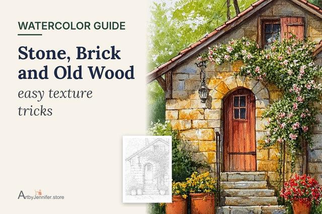
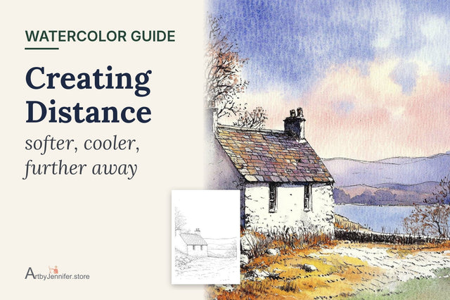
Green gives most of us trouble. It's everywhere in a cottage scene, in gardens, hedges, hills, trees and climbing roses, yet green straight from the tube tends to look flat or unnaturally bright. Real landscapes hold dozens of greens: yellowy greens in the sun, blue-greens in the distance, deep olive greens in the shade.
My early cottage pages all had the same problem. I'd mix one nice sap green and use it for the hedge, the hills, the tree and the grass, and the whole page looked like it was cut from the same piece of felt. What changed it wasn't a better green; it was learning to make three or four different ones on every page.

New to painting coloring pages? Start with my step-by-step guide on how to watercolor a coloring page, then come back to this one.
Why tube greens look flat
Tube greens such as sap green, viridian and phthalo green are useful, but on their own they look the same everywhere. Nature rarely does that: light, distance and shadow all change a green. Sap green is a lovely starting point. The trick is to adjust it rather than use it straight.
Mixing greens from blue and yellow
Any blue plus any yellow makes a green, but the pair you choose changes the result a great deal.

- Lemon yellow + phthalo or cerulean blue: bright, fresh spring green for sunlit leaves and new grass.
- Warm yellow + ultramarine: a softer, slightly olive green for hedges and summer trees.
- Yellow ochre + ultramarine: a muted moss or sage green for old gardens, distant fields and lichen.
- Yellow ochre + phthalo or cerulean: a soft gray-green for misty hills.
The colors that lean toward each other make the brightest mix, and the ones that lean away make softer mixes. A Six-Color Watercolor Palette explains why.
Adjusting a green
To warm it up, add more yellow, or a touch of yellow ochre or orange. Warm greens look sunlit and close.
To cool it down, add a little more blue and more water. Cool, pale greens recede, so they're right for faraway hills.
To soften a green that's too bright, add a tiny touch of its opposite on the color wheel, a red. Burnt sienna, a little scarlet or a rose will all knock the brightness back into a natural, earthy green. Start very small; it's powerful.
To make a shadow green, mix a strong green and add a little ultramarine and a touch of crimson or burnt sienna. It reads as shade rather than black.
Greens and distance, in short
Far hills want a pale, cool green with little detail. Middle hills want a medium green with a touch of yellow ochre. The nearest grass gets your warmest, strongest green and the most detail. That's the whole idea; Creating Distance with Softer, Cooler Color goes into it properly.
How I painted the glen cottage

Sky and lake. A soft cerulean wash for both, with the lake left a little paler where it catches the light.
Far hills. The color guide uses yellow ochre and sap green. I wet the far hills, then dropped in pale yellow ochre and a little sap green mixed with cerulean, keeping them light and soft. They dried before I touched the nearer slopes, so the edges stayed separate.
Nearer slopes and grass. Sap green with more yellow ochre for the middle slopes. For the grass around the cottage, sap green warmed with a warm yellow, strongest at the bottom of the page, with a little burnt sienna dropped in while damp for patches of dry grass and soil. I left tiny gaps of paper here and there, which read as light in the grass.
The cottage. Diluted Payne's grey for the slate roof and the stones, with some stones left almost white. Then the cadmium red door, the climbing roses and a burnt sienna fence. That red door is the focal point: red and green are opposites, so each makes the other look brighter.
Shadows. Last, a shadow green under the eaves, beneath the fence and at the base of the walls, plus a few darker strokes in the grass near the cottage to bring the foreground close.

Common green problems
| What you see | Why it happens | What to try |
|---|---|---|
| Green looks fake or neon | Bright tube green used straight | Soften with a touch of burnt sienna or red |
| Hills look flat, no distance | Same green near and far | Make far hills paler and bluer |
| Shadows look black | Payne's grey or black added | Darken green with ultramarine and a little crimson |
| Greens look muddy | Too many colors in one mix | Mix one blue with one yellow, then adjust lightly |
| Everything looks the same | Only one green used | Mix three greens before you start |
Frequently asked questions
How do I make a natural green in watercolor?
Mix a blue and a yellow, then soften the result with a tiny touch of red or burnt sienna. Yellow ochre with ultramarine also gives a soft, natural green.
Should I use tube greens or mix my own?
Both work. Tube greens such as sap green are convenient; just adjust them with yellow, blue or an earth color so they don't look the same everywhere.
How many greens should I use on one page?
At least three: one for the distance, one for the middle and one for the foreground. Letting a little yellow or blue mingle into each while it's damp gives you even more variety for free.
Practice pages
Cottages set among hills, gardens and trees are the best place to practice greens. The 26 Cozy Cottage set has glens, meadows and woodland cottages, each with a color guide showing my paints.
For trees in particular, Trees and Foliage in Three Layers shows how I build a green tree from light to dark.
If a green keeps turning olive, the color wheel explains why: Watercolor Color Wheel for Beginners shows how each yellow and blue leans, and what that does to a mix.