When a cottage page looks a little flat even though every color is right, the missing ingredient is almost always shadow. A cottage only looks sunny if part of it is clearly in shade. The sunlit wall glows because the wall beside it is darker, and the door looks set into the stone because there's a shadow inside the frame.

New to painting coloring pages? Start with my step-by-step guide on how to watercolor a coloring page, then come back to this one.
First, decide where the sun is
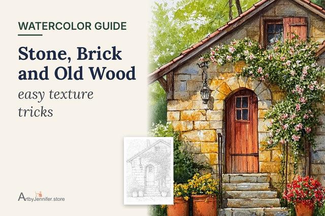
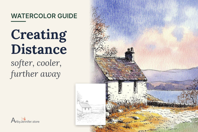
Before you paint anything, decide where the light comes from. On this bothy the sun is on the left, so the gable end with the red door faces the light and the long side wall is in shade. Every shadow on the page has to agree with that one decision.
If you're not sure, look for clues in the line art: which side of the chimney would be dark, which way the roof overhangs. Then mark a small pencil arrow in the corner of the page as a reminder.
Three kinds of shadow

Form shadow is the whole side of the cottage facing away from the sun. It tells your eye the building is a solid box, not a flat shape. Its edges can be a little softer where they turn a corner.
Cast shadows are the ones one thing throws onto another: the roof overhang casting a band along the top of the wall, the door frame casting a shadow onto the door, a chimney casting one across the roof. They usually have crisp edges, and they're what make details look three-dimensional.
Ground shadow is the cast shadow the cottage throws onto the grass or path. It anchors the building to the ground; without it, cottages tend to look as if they're floating.
Shadow colors
Outdoor shadows are cool, not gray or black, because they're lit by the blue sky. (The full explanation is in Warm and Cool Light.) These are the mixes I reach for:
- Ultramarine: a clean, pale blue for shadows on white walls and paths.
- Ultramarine with a little violet: softer and slightly warmer, lovely on stone.
- Ultramarine with burnt sienna: a deeper blue-gray for the darkest cast shadows, under the eaves and inside the door frame.
- The local color, cooled: for shadows on colored things, like the red door, the same red with a little ultramarine added.
Leave the sunlit wall alone
This is the tip in the color guide for this page, and the one I most often have to remind myself of. On my early stone cottages I painted every single stone on every wall, because the line art showed them and it felt like cheating not to. The sunny walls ended up just as busy as the shady ones, and nothing glowed.
The brightest wall should be bare paper, or the faintest wash of warm stone color with a few stones hinted in. Put your detail in the shade, where it belongs, and let the light side breathe.
How I painted the stone bothy

Sky, mountains and lake
The sky is cerulean, fading toward the horizon. Once it was dry, the mountains went in with raw sienna, with a little violet dropped into the shadowed slopes while damp; mountains have sunny and shaded sides too. The lake is ultramarine, slightly stronger near the far shore, with a thin streak of paper left for light on the water.
Roof and stones
The roof is ultramarine, a little darker on the slope away from the sun. On the shaded side wall I painted a few stones with pale raw sienna and Payne's grey. On the sunlit gable, just a handful of stones in very pale raw sienna, and the rest left white.
The shadows
Once everything was dry, I glazed a single wash of pale ultramarine over the whole shaded side wall. It cools the stones underneath without hiding them, the same technique as in Watercolor Glazing. Then came a crisp band of shadow under the roof overhang, a thin dark line under the door lintel, and a shadow down one side of the door recess.
Red door and grass
The door is cadmium red, with a darker red (a touch of ultramarine added) on the side in shadow. The grass is yellow ochre, and a soft blue ground shadow stretches away from the bothy. That red door against the bright white wall is where the darkest dark meets the brightest light, which is why your eye goes straight to it.

Common shadow problems
| What you see | Why it happens | What to try |
|---|---|---|
| Cottage looks flat | Both sides painted the same value | Glaze a cool shadow over the side away from the sun |
| Shadows look dirty | Gray or black used for shade | Use ultramarine or a cooled version of the local color |
| Shadows look patchy | Built up in several small layers | Paint each shadow as one transparent glaze |
| Cottage seems to float | No ground shadow | Add a soft shadow on the grass or path |
| Shadows point different ways | Light direction not planned | Decide on the sun first and mark it on the page |
Frequently asked questions
What color should shadows be in watercolor?
Usually cool: a pale ultramarine or blue-violet outdoors, or the object's own color with a little blue added. Avoid plain gray or black.
Should I paint shadows first or last?
Near the end, as a transparent glaze over dry color. That way the shadow cools what's underneath without hiding it.
How dark should a shadow be?
Darker than you think on cast shadows, especially right next to the sunlit wall, and a little lighter on the form shadow so the stones still show.
Practice pages
The 26 Cozy Cottage set is full of sunny cottages with strong light and shade, and each page has a color guide with my paints. For mixing the stone grays in the shade, see Natural Grays in Watercolor.