Most of the time we paint the thing we want to see: a red petal, a green leaf, a blue roof. Negative painting flips that around. You paint the space around the leaf, and the leaf appears in the color that was already there.
It sounds backwards, but watercolor leaves you little choice. Because it's transparent, you can't paint a pale leaf on top of a dark background the way you could with acrylics. The only way to keep a light shape light is to leave it alone and darken everything next to it.

New to painting coloring pages? Start with my step-by-step guide on how to watercolor a coloring page, then come back to this one.
What negative painting means
Think of a sunny hedge. The leaves in front catch the light and look pale. The ones further back are in shadow and look darker. With negative painting, you lay a light wash first, then paint a darker color around the shapes you want to keep pale. Those shapes are now "in front". Repeat with an even darker color and a second set of shapes appears behind the first.
You get depth without any extra outlines. Light shapes against dark read as objects sitting forward, which is how we see real foliage.

Why it suits coloring pages
On a coloring page the lines are already there, which makes this far easier than on a blank sheet. You can see exactly where each leaf or petal ends. All you decide is which shapes stay light.
It fits the busy parts of a flower page especially well: leaves overlapping leaves, stems crossing behind petals, and the soft background between them.
What you'll need
- A coloring page printed on watercolor paper, so it can take several layers
- A medium round brush (size 6 to 8) for washes and a small round (size 2 to 4) for tight corners
- One or two greens, plus a blue or violet for the darker layers
- Patience between layers, because each one must be completely dry
Three layers of leaves
Layer 1: a pale wash over everything
Paint a light, watery green over the whole leafy area, leaves and gaps alike. Tea strength is perfect. Drop in a little yellow in some places and a little blue in others so it isn't flat. This wash becomes the color of your nearest, brightest leaves. Let it dry completely.
Layer 2: paint around the front leaves
Choose a few leaves that should sit in front. Mix a slightly deeper green and paint the spaces around them: the gaps between leaves, the background behind them, and any leaves you've decided are further back. Leave the chosen front leaves untouched. Soften the outer edge of this wash with a damp brush so it fades into the paper.
Before you load the brush, decide which leaves you're keeping. I put a tiny pencil dot on each one now, because more than once I've been happily painting around leaves, lost track, and filled in the one leaf that was meant to be the brightest on the page. Once it's covered, there's no getting that pale green back.
Layer 3: deeper again
When layer 2 is dry, pick a few more shapes inside the layer 2 area to keep. These become the middle leaves. Mix a darker green with a touch of blue or violet and paint around them, mostly in the deepest gaps close to the flower. Keep this layer small; the darkest darks only need to appear in a few places to make everything else glow.
Three layers is usually enough. If you want more drama, a tiny fourth layer of your darkest mix in the tightest corners adds a lot of depth.
How I painted the peony cluster

The flowers came first: a light wash of quinacridone rose for each petal, alizarin crimson dropped in near the center while the petal was still damp, and quinacridone gold in the centers once the petals were dry. I left thin slivers of paper between some petals so they don't run together.
Then the leaves. A pale sap green wash went over all of them. When that was dry, I mixed sap green with viridian and painted around the leaves nearest the flowers, along with the shadowy gaps between petals and leaves. A final, darker mix of viridian with a little alizarin crimson went into the deepest corners right next to the petals. That dark edge makes the pink look brighter; nothing lifts a light color like a dark one beside it.

A few habits that help
- Work in small sections. Paint one pocket of background at a time so the edges don't dry before you finish.
- Crisp inside, soft outside. Edges against the shapes you're keeping should be sharp; the outer edges of each wash should fade.
- Stay in one color family. Greens that get darker each layer look more natural than switching to a completely different color.
- Stop while it still looks fresh. Too many layers start to look heavy.
Questions and fixes
What is negative painting in watercolor?
Painting the space around a shape instead of the shape itself, so the shape is left in a lighter color that was painted earlier.
How many layers do I need?
Two or three are enough for most flower pages. Each layer adds one more level of depth.
Why did my layers bleed into each other?
The layer underneath was still damp. Wait until the paper is completely dry and no longer cool to the touch.
Why do my kept leaves look flat?
Not enough contrast. Make the next layer noticeably darker than the one before it.
I painted over a leaf I meant to keep. Now what?
If it's still damp, lift it with a clean damp brush and a tissue. If it's dry, let it become a back leaf and choose a different one to keep in the next layer. Nobody will know.
Can I use negative painting for things other than leaves?
Yes: petals against a background, fence posts, tree trunks, snow-covered branches and light windows against a dark wall.
Practice pages
Flowers with lots of overlapping leaves are the best place to practice. The 24 Simple Flowers set has peonies, roses and wildflower bunches, each with a color guide showing the paints I used.
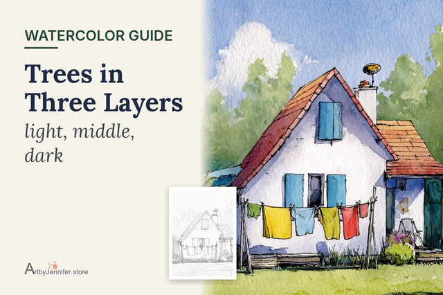
Negative painting is really glazing with a plan, so if the layers keep going muddy, Watercolor Glazing is worth a read. The same idea also builds up trees, as in Trees and Foliage in Three Layers.