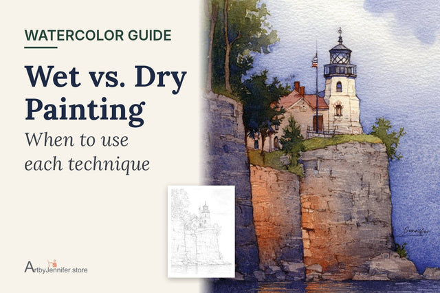
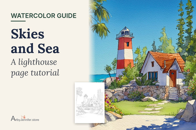
A lighthouse looks like the hardest thing on a coastal page: a tall white tower, perfectly even stripes, a little glass room on top with a railing around it. It's actually one of the most forgiving subjects in watercolor, because most of it is white paper you never touch. The trick is knowing which few parts to paint, and in what order.
Here is how I paint a lighthouse, using the red-and-white tower from my lighthouse set, plus two other towers that need a slightly different approach.

New to painting coloring pages? Start with my step-by-step guide on how to watercolor a coloring page, then come back to this one.
What you need
A round brush around size 8 for the sky and grass, a small size 2 or 4 for the stripes and the lantern, and five or six colors. For this tower I used cerulean blue, cadmium red, quinacridone rose, burnt sienna, sap green and a touch of opera pink for the flowers. If your paint set is smaller, any clean red and any sky blue will do. Print the page on watercolor paper if you can; a sky wash uses a lot of water. Watercolor Paper Explained covers which paper to use.
The order that makes it easy
1. Paint the sky first, and let it dry
The sky is the biggest, wettest wash on the page, so it goes first. I wet the sky area with clean water, then drop in cerulean, a little stronger at the top and paler near the horizon. Leave a few patches of paper white for clouds. Paint right up to the tower's edge, but not over it.
Then stop and wait. The sky has to be completely dry before you go near the lighthouse. If you paint red stripes next to a damp sky, the red will creep into the blue and you'll get a pink halo around the tower. Touch the paper with the back of your finger: if it feels cool, it's still wet. Skies are covered step by step in Watercolor Skies and Sea.
2. Leave the white parts as paper
This is the part that surprises people. The white bands of the tower, the white lantern room and the railing aren't painted white. They're the paper itself. White paint in watercolor goes chalky and dull, while bare paper glows. So when you look at a white lighthouse, think of it as "everything I'm not going to paint."
3. Paint the stripes one band at a time
Mix more cadmium red than you think you need, so the color is the same from the first band to the last. Paint one stripe, edge to edge, with a smaller brush. Then skip to the next stripe down and paint that one. The white band between them keeps the stripes from touching while they're wet.
Keep the edges as clean as you can, but don't fuss. If a stripe edge wobbles a little, it still reads as a stripe from a step away.
4. One soft shadow makes it round
Once the stripes are dry, this is the step that turns a flat shape into a tower. Mix a very pale, watery blue-grey (a little cerulean with a touch of its opposite, or a dot of Payne's grey) and paint a soft strip down one side of the tower, over the white and the red. Soften its inner edge with a damp brush so it fades toward the middle.
That single shadow is what tells the eye the tower is a cylinder. Choose the side away from the light and keep it on that side all the way down.

Look at the stripes on the line art, too. On a round tower they aren't straight lines; they curve gently downward at the edges, like the rim of a cup seen from slightly above. Follow the drawn curve and the shape will look right even before the shadow goes in.
5. The lantern room and railing
The lantern room is mostly glass, and glass on a sunny day is mostly light. I paint only a little pale blue-grey inside a few of the panes and leave the rest white. The railing is already drawn for you, so you only need a few tiny shadows under the rail. If the roof of the lantern is dark, paint it last with a small brush and a strong mix.
6. Buildings, grass and flowers
Now the supporting cast. On this page the cottage walls get a wash of quinacridone rose and the roof gets burnt sienna. The grass is sap green, a little lighter where the sun hits, and the flowers are dabs of opera pink and red on top once the green is dry.


A striped tower on a hillside
The same method works when the lighthouse is small and far away. On the striped lighthouse above the village, the tower sits high on the hill behind a row of thatched cottages, and most of the page is grass and a stone path.

The order is the same: sky first in cerulean, then the red stripes, then the hillside with lemon yellow and sap green, and finally the roofs and path with Payne's grey and a violet shadow across the foreground. Because the tower is small, use your smallest brush for the stripes and keep the shadow side very subtle. A big dark shadow on a small tower makes it look heavy.
The violet at the bottom of the page is worth trying. Darker, cooler color in the foreground pushes the lighthouse back and makes the hill feel deep. There's more on that in Creating Distance in Watercolor.
Not every lighthouse is white
Some old towers are built of bare stone. On the stone tower with a thatched cottage, there are no stripes at all, and the tower is the same grey stone as the rocks around it.

Here I paint the sky in ultramarine first, then the thatch with raw sienna in long strokes that follow the roof. The stone tower and the rocks are shaded with Payne's grey, darker on the shadow side and down in the gaps between stones. The little touches of color go in last: a cadmium red door, an orange autumn tree and a viridian roof on the lantern.
Even on a stone tower, keep plenty of paper showing on the sunny side. Stone looks like stone because of the darks in the cracks, not because every block is filled in. Stone, Brick and Old Wood goes deeper into painting walls.
Common lighthouse mistakes
Painting the tower before the sky is dry. This is the most common one. The sky looks dry on top but is still damp underneath, and the red bleeds out. Give it longer than you think.
Painting the white parts white. White paint over a light wash goes milky. Leave the paper.
A shadow on both sides. Light comes from one direction. Shading both edges makes the tower look like a tube in fog instead of a building in the sun.
Mixing too little red. If you run out halfway and mix again, the second batch never quite matches. Mix a puddle big enough for every stripe.
Too much detail on the rocks. A few dark cracks are enough. If the rocks are busier than the tower, the eye won't know where to go.
Frequently asked questions
Do I need white paint to paint a lighthouse?
No. The white of a lighthouse is the white of the paper. Paint around it, and add only a soft blue-grey shadow down one side.
How do I get straight stripes on a lighthouse?
Use a small brush and follow the printed lines, painting one stripe at a time and skipping to the next one so wet stripes never touch. On a round tower the stripes should curve slightly at the edges, so don't try to make them ruler-straight.
What colors do I need for a lighthouse painting?
A sky blue such as cerulean, a clean red for the stripes, a green for the grass and a grey or a mix for shadows and rocks. Everything else, like flowers or a roof, is a bonus.
Can I paint a lighthouse with watercolor pencils?
Yes. Pencils are especially good for the small parts: the stripes, the lantern panes and the railing. You can paint the sky with a brush and do the tower in pencil. Watercolor Pencils vs Paint shows how to combine them.
Practice pages
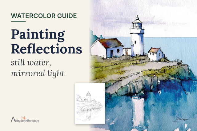
All three towers in this post come from 29 Simple Lighthouses. Each page has my finished painting, a color guide and a clean line drawing, from simple white towers on the rocks to harbor lights and sunset reflections. Once your lighthouse is done, Painting Reflections is a lovely next step for the ones that stand by the water.